Kapital Norges ledende businessmagasin
All about the numbers Clarifying an editorial profile
Strategy | Concept | Visual identity | Editorial design | Art direction
The lead player of Norwegian business journalism
Kapital is Norway's leading business magazine, established in 1971.
It was with a certain awe that we undertook the assignment of carrying out a total redesign of the 47-year-old magazine Kapital – a leader within Norwegian business journalism, and a magazine with a clear editorial DNA and visual design language.
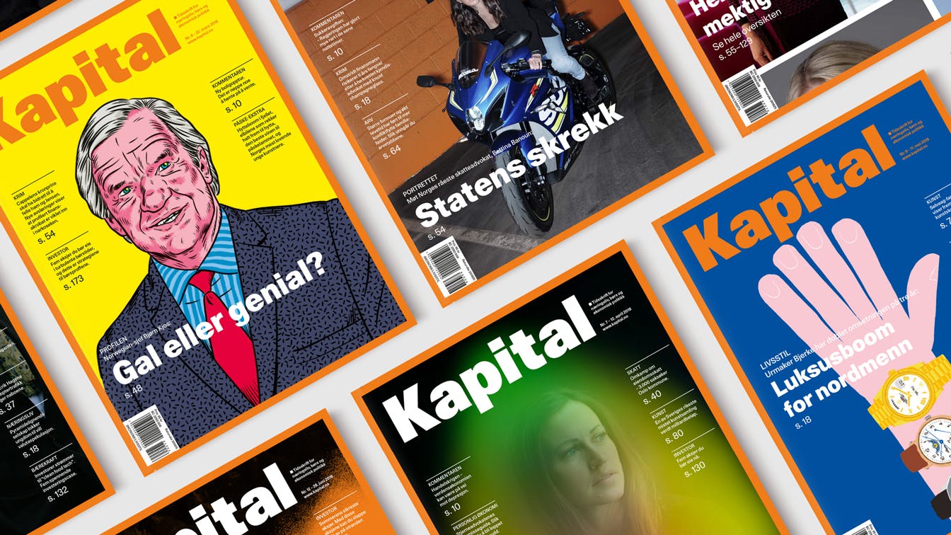
Kapital's visual profile, with orange frame and bold, black typography, has remained more or less unchanged since its initial launch. Over the years the magazine has gained a certain cult status for being uncompromising, hard-hitting and offensive.
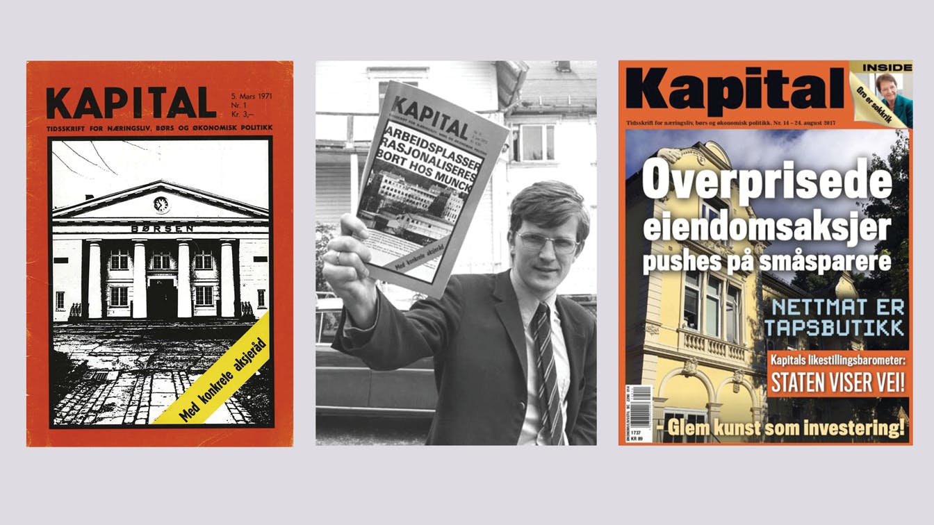
Launched in 1971: The first edition of the magazine came out 47 years ago.
Preserving the essence
Changing a well-established visual profile is just as much about preserving as renewing. The ambition was to use design as a tool for recruiting new readers, but never at the expense of existing ones. Rather than discarding a well-established identity, the starting point was to build on and reinforce what already works today.
The objective of the project was to create a visual framework which further strengthened Kapital's editorial profile.
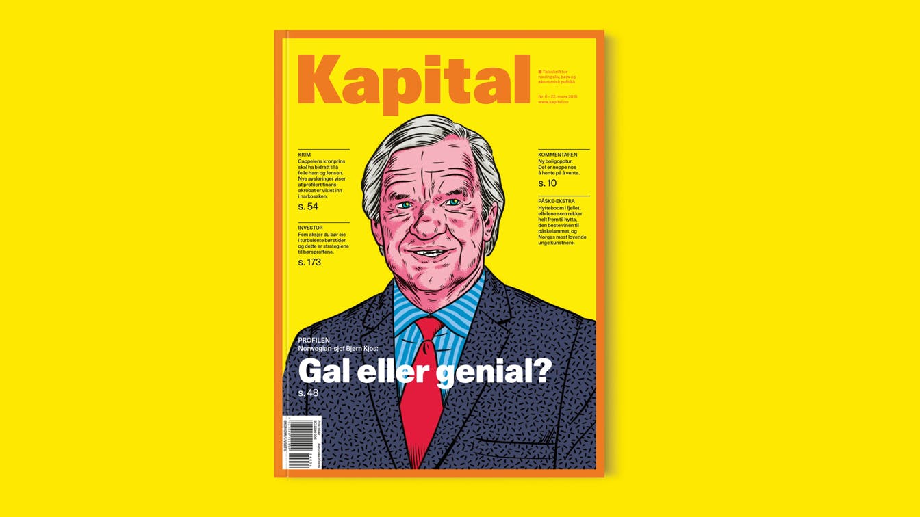
Illustrated front page: When we launched the first edition with a new design in April 2018, we used an illustrated portrait of Norwegian-manager Bjørn Kjos. Illustration: Kristian Hammersatd, byHands
Identity through numbers: Throughout the magazine, numbers are actively used for navigation.
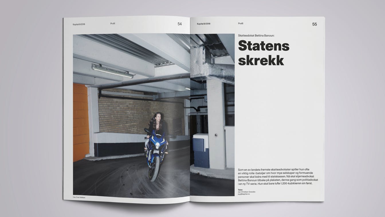
Visual journalism: The use of images and illustrations has been given a more prominent role. Photo: Einar Aslaksen
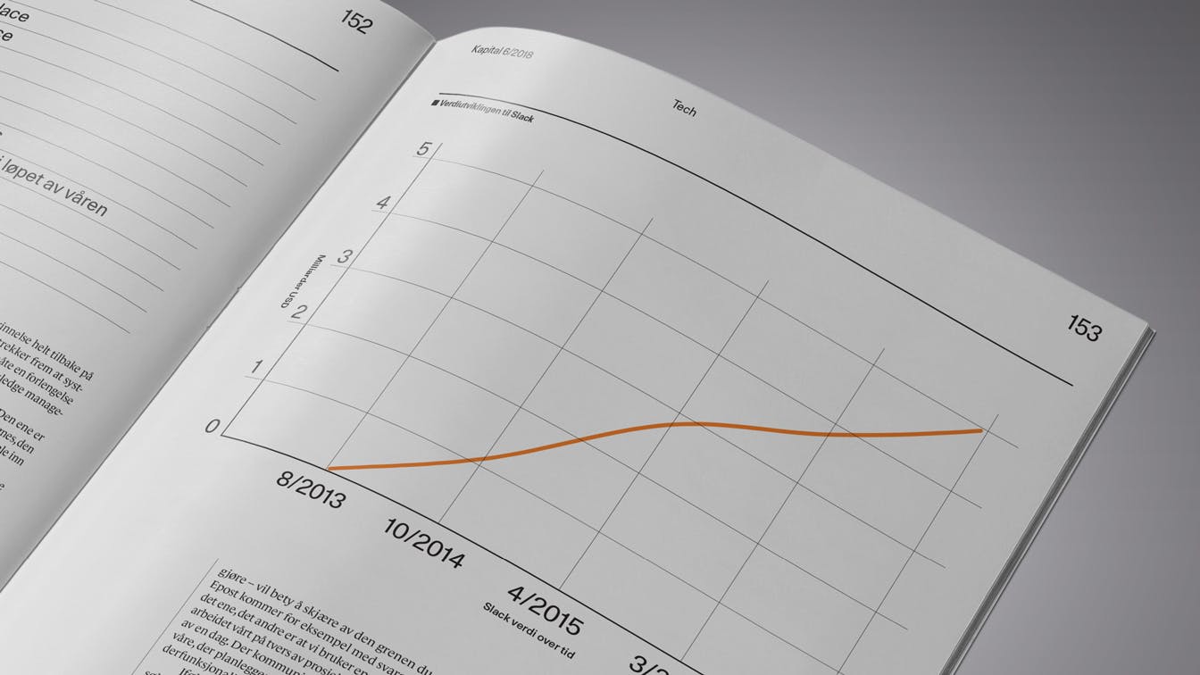
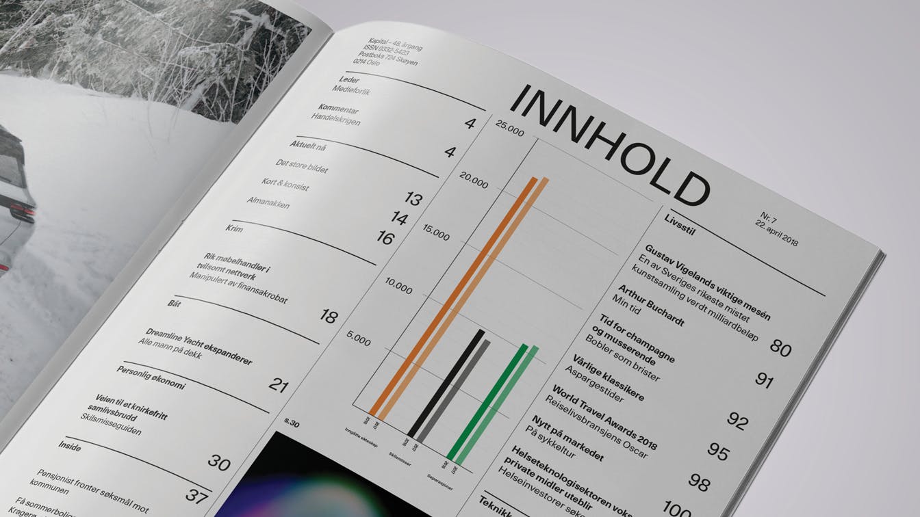
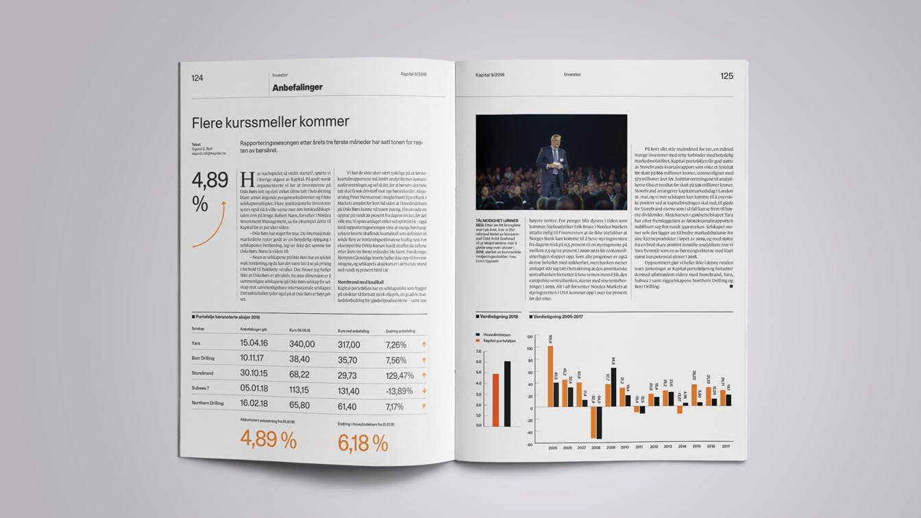
Provides space for infographics: Instead of looking at graphs and tables, which are an important part of Kapital's editorial content, as something visually boring, we have chosen to give them space and work actively with the design.
Key figures in the margin: As a general principle, key figures from the content are highlighted and placed in a separate column. Photo: Christian Breidlid, Paragon Features
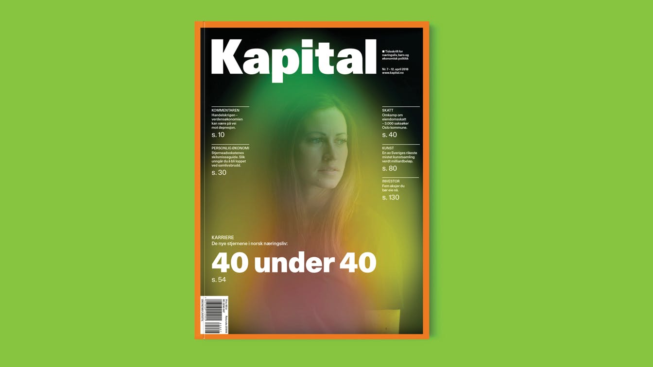
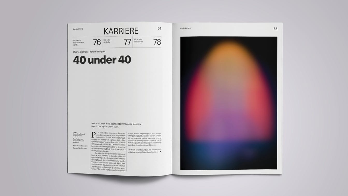
Aura photography: When the cover story was about 40 young management talents, Skilhagen chose to use aura photography. A technique from the 70's, which is in great contrast to the magazine's editorial profile. Photo: Monica Strømdahl
Clarifying the editorial DNA
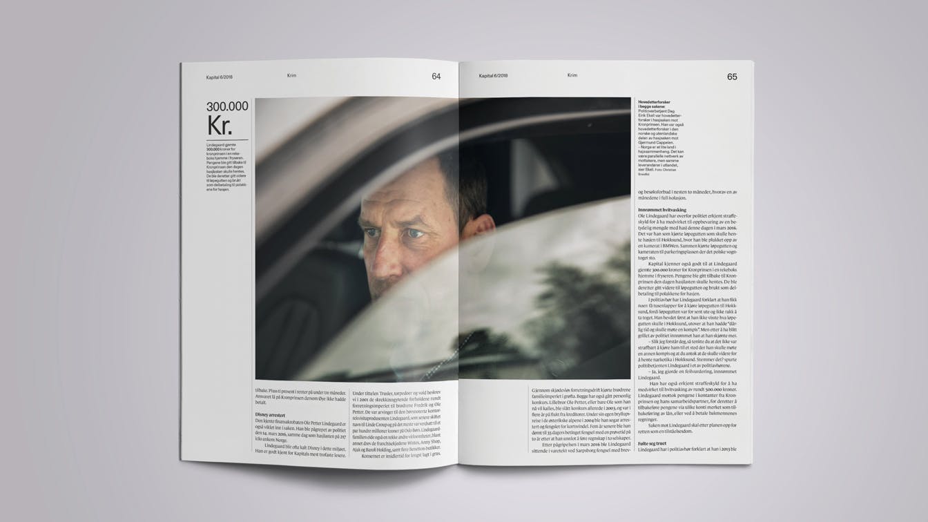
A distinct feature in the magazine's editorial content is the use of numbers – numbers based on business, stock exchange and lists of companies and individuals. This was something we wanted to visually enhance. Key figures in the articles have been given a more prominent place, and the journalists can easily highlight relevant numbers.
Numbers are also highlighted in running texts without compromising the reader's experience. This makes it easy to scan through an article to find key information and relevant numbers.
Section Pages: As part of the redesign, we have introduced introduction pages to the different sections, helping to simplify navigation. Photo: Monica Strømdahl
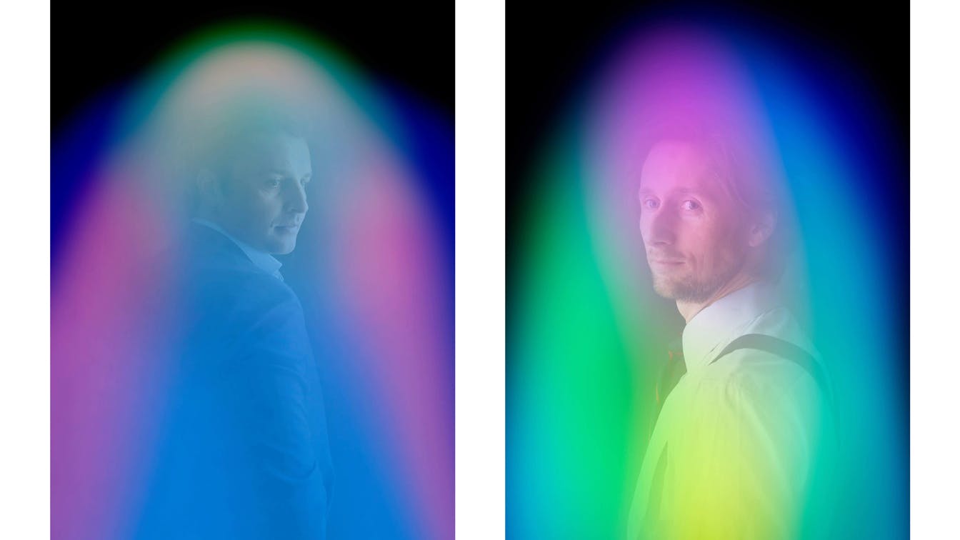
Visual surprises: The ambition of the project has been to give the magazine a visual boost beyond just design principles. In the first editions, we have acted as art directors and visual storytellers. In edition 7 2018, we chose to use aura photography when young leadership talents were to be portrayed. Photo: Monica Strømdahl
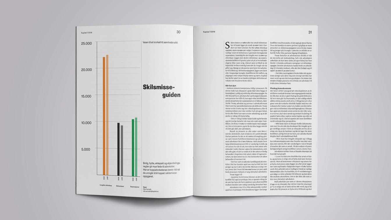
Attractive infographic: Instead of hiding graphs and tables, we chose to make them more prominent.
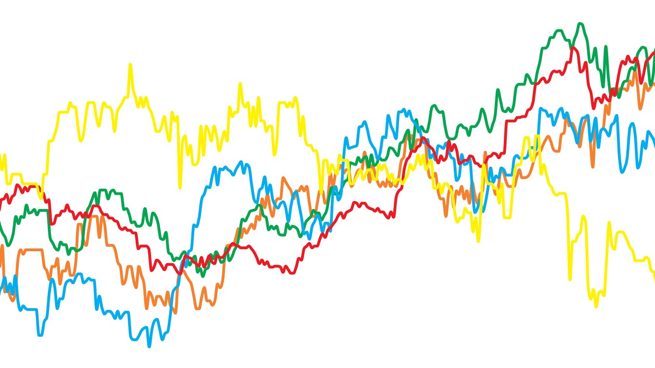
Strong colors: In the new visual profile of Kapital, we have chosen to go for strong primary colors for tables, graphs and other infographics.
Simplify the complexity: Through layout principles and hierarchical principles we have worked actively to simplify sometimes complicated content.
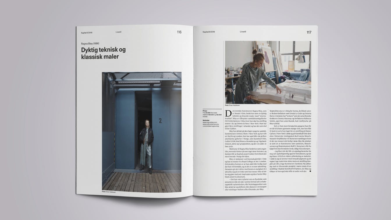
Space for pictures: In individual cases, we have placed extra emphasis on the use of photography, and provided necessary space for this in the layout. Photo: Einar Aslaksen
Focus on visual journalism
Visual journalism through photography and illustration has been given a more prominent role in the redesigned magazine. Instead of a solution where the visual repeats the textual content, we have focused on a visual storytelling where the two complement each other.
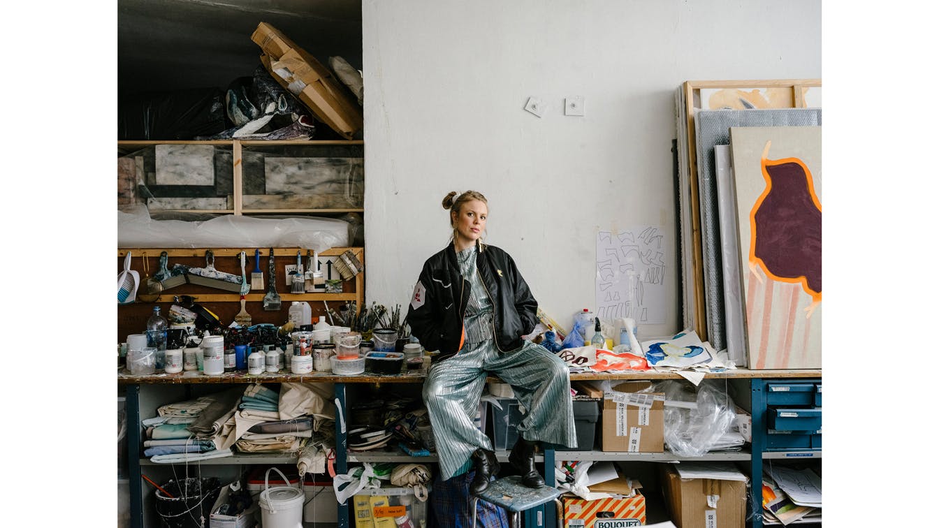
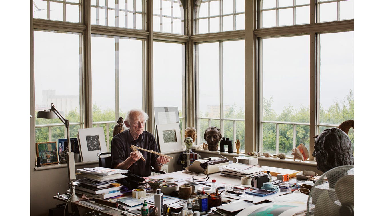
Young, promising artists: When Kapital was to present a selection of artists they currently think are people who make art one should invest in, we chose to portray the people in their own studio. Photo: Einar Aslaksen
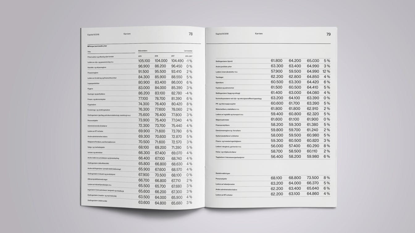
Figures and tables: Yet another example of active use of numbers and the effect of giving tables a more prominent place
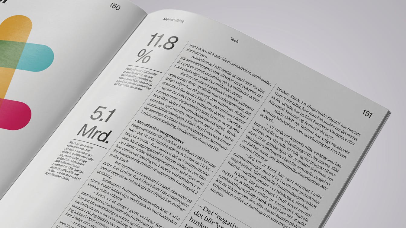
Key figures: On each spread, a separate column is given to highlight relevant numbers.
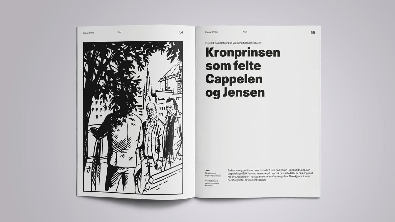
Illustrators: A number of the stories in Kapital after the redesign are communicated through the use of illustrations. Illustration: Trond Bredesen
The magazine as an object
In addition to increasing the magazine's format to industry standard in order to accommodate advertisers, we have changed the paper stock on both the cover and the inside. This gives a clear tactile identity, and through the use of two different paper qualities inside, the navigation is also simplified.
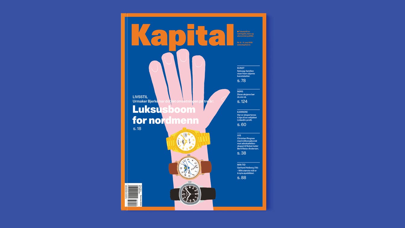
Illustrated cover: Luxury and watches. Illustration: Espen Friberg
Surveys show that Kapital readers spend an average of 60 minutes per edition. With such high numbers, tactility and the magazine as an object become an important part of the overall experience.
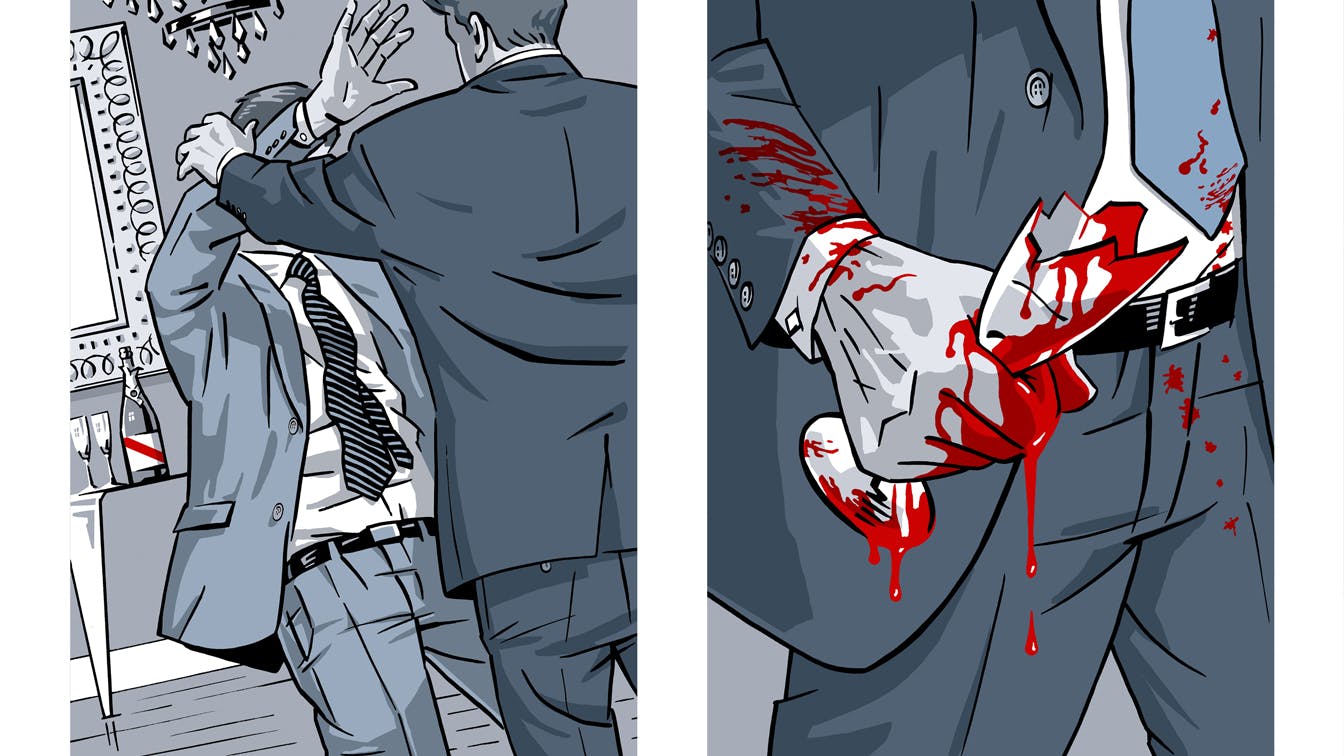
Visual journalism: In cases where it can be difficult to obtain photographs or other visual documentation, we have chosen to illustrate the current course of events in order to compliment the texts. Illustration: Trond Bredesen
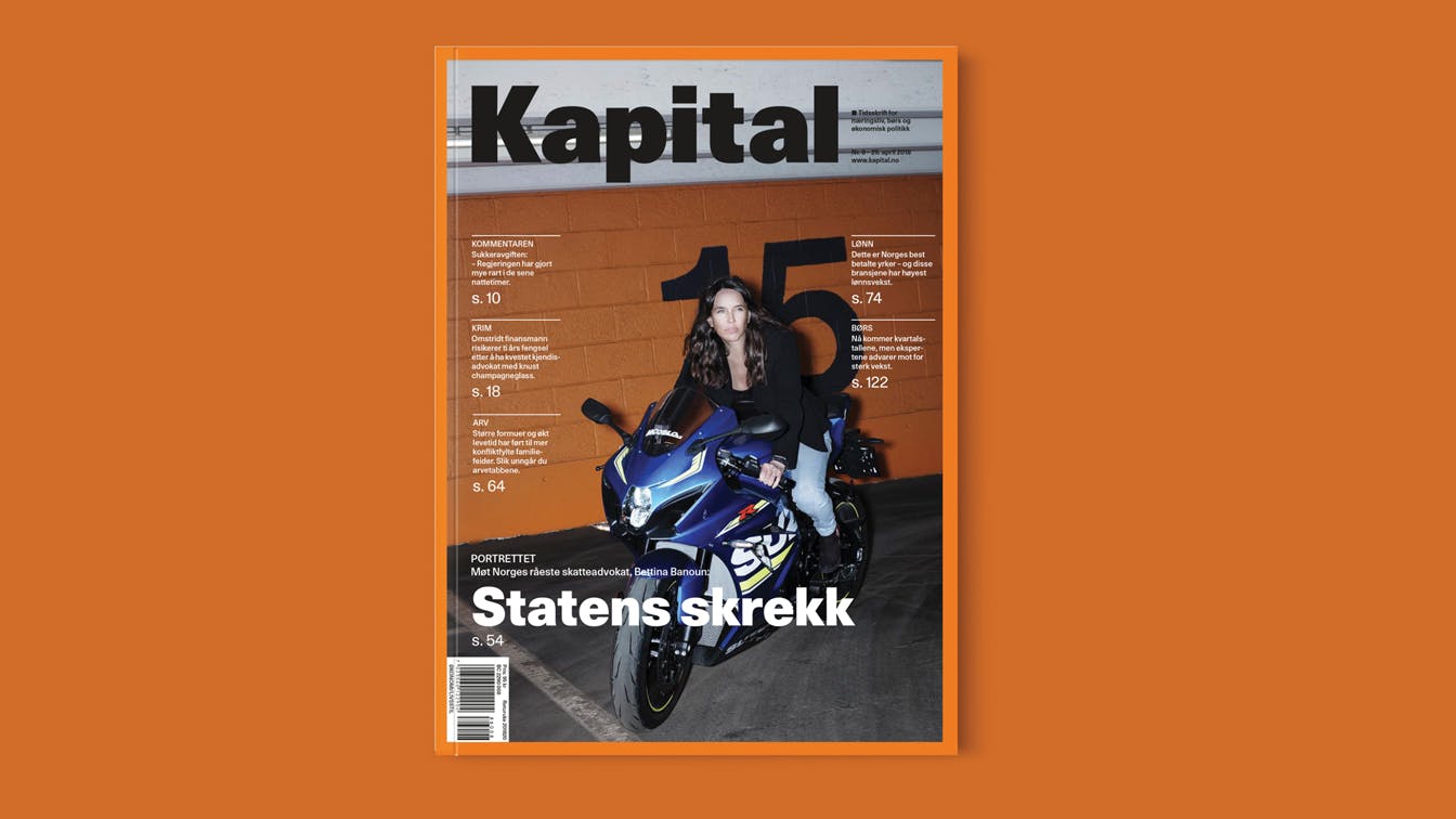
The orange frame: The orange frame that has featured Kapital for all years is kept, and active use of the orange identity color is highlighted. Photo: Einar Aslaksen
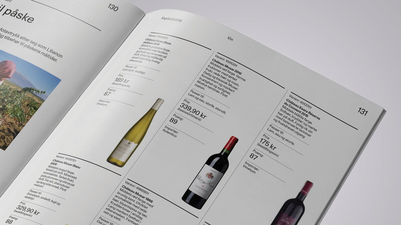
Wine: A separate section on wine is a new editorial contribution to Kapital
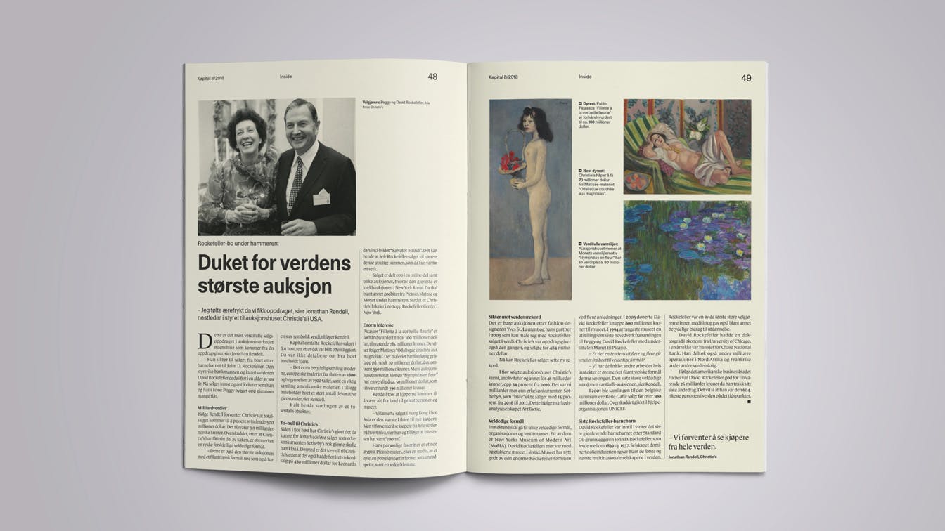
Variations in tactility: In the section Inside we use another paper then in the magazine otherwise. This provides a tactile break and contributes to easier navigation.
Personal meetings: The photograph is actively used as a separate voice in portrait interviews. Foto: Therese Alice Sanne

Regular content: Guest comments are one of several fixed columns found in Kapital
A subtle, but important adjustment
The initial idea was never to redesign the Kapital logo, which has a strong visual recognition. Subtle adjustments in line with changes to the fonts in the magazine were nevertheless a natural result of the project's totality.
Subtle adjustment: As a result of the redesign, we chose to change the style of the Kapital logo. A subtle but necessary adjustment.
Before and after: Recognizable, but new.
Increased readability and navigation
Variation in column-widths, with long articles being ascribed broader text columns, contributes to increased readability and variation in tempo and expression.
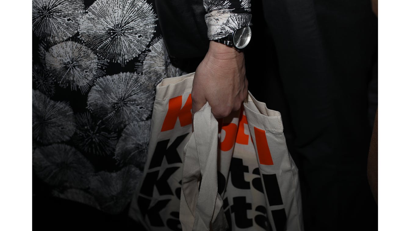
Launch: The first edition was launched in April 2018. Photo: Rune Kongsro
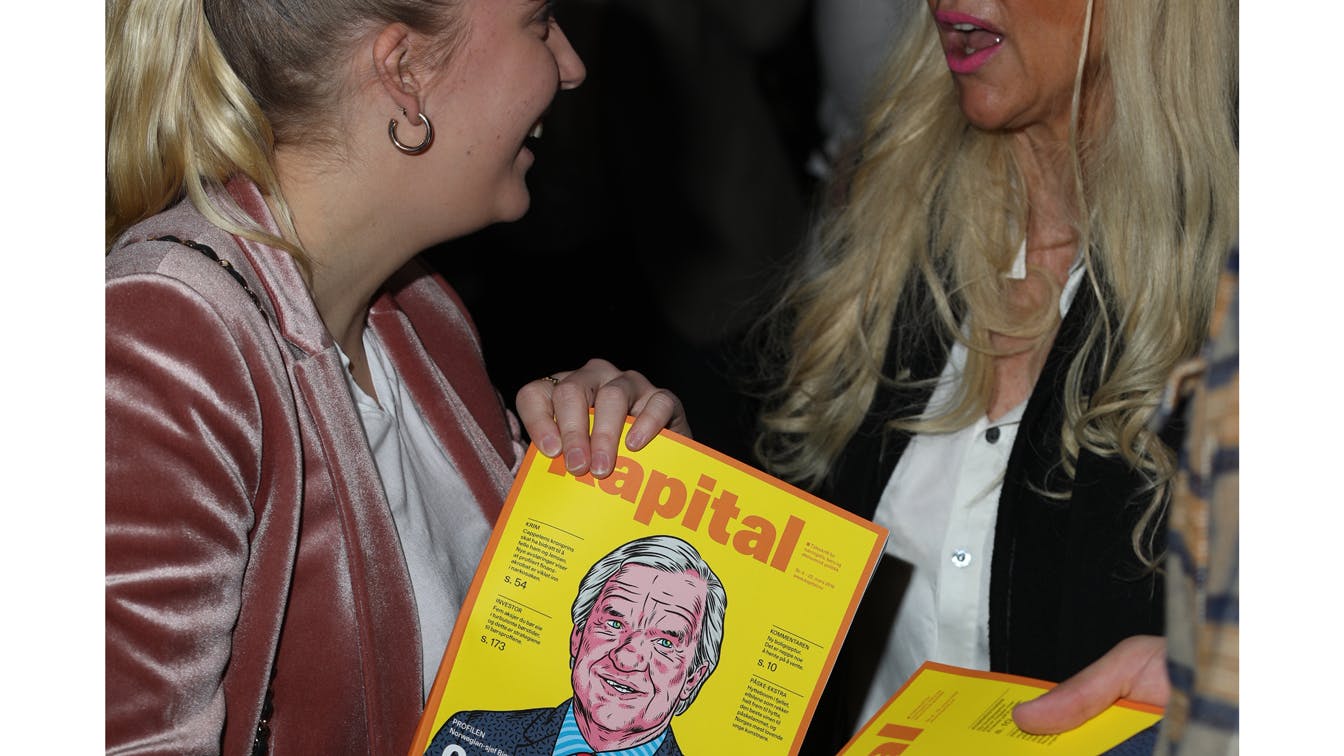
Launch party: In connection with the launch of the first edition, a larger party was arranged at Latter in Oslo. Photo: Rune Kongsro